

Decoding Sectional Charts: The Foundation of VFR Flying
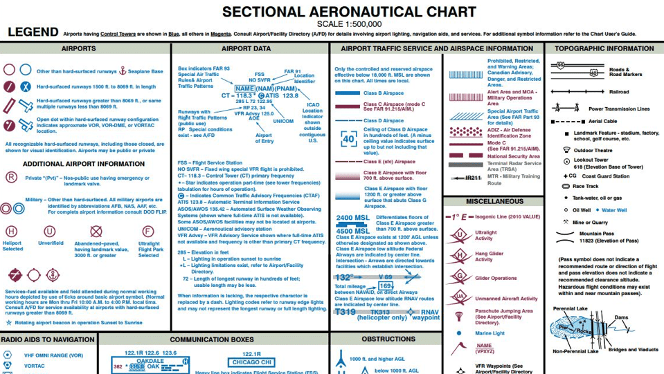
Sectional charts are essential for Visual Flight Rules (VFR) flying. These specialized maps, scaled at 1:500,000, provide crucial information for safe and legal navigation. They’re a universal language for pilots, balancing detailed data with a design that prioritizes quick comprehension during flight. But why are these charts so vital, and how do pilots learn to interpret their intricate symbols?
Understanding the Chart’s Structure
Think of a sectional chart as a layered cake. Each layer represents different crucial information. The base layer depicts geographical features like terrain, water bodies, and landmarks, providing real-world context for your flight path. Overlaid on this are markings for airspace classifications, using specific colors and line styles to indicate the rules and restrictions of the air above. You’ll also find symbols for airports, navigation aids, and obstacles, each designed for quick identification. This blend of geographical and aeronautical data makes sectional charts indispensable.
From Humble Beginnings to Modern Marvels
The history of sectional aeronautical charts dates back to 1930 when the first chart was published. A complete series covering the contiguous 48 United States was finalized by 1937. These early charts were smaller and contained less information than modern editions. (Explore this topic further.) Modern charts, whether paper or digital, are updated every 56 days to reflect changes in airspace, navigation aids, and obstacles. This ensures pilots have the most current information, vital for safe flight planning.
Practical Tips for Chart Interpretation
Developing chart literacy is an ongoing process. Veteran aviators often emphasize cross-referencing information. For example, using visual landmarks on the chart to confirm your position relative to airspace boundaries or navigation aids reinforces situational awareness. Understanding the differences in airport symbols, like those between towered and non-towered airfields, can inform your approach and communication procedures.
Read also: How to master cross-country flight planning. Effective cross-country planning is crucial for using sectional charts effectively.
To help illustrate the various types of charts and their uses, the following table provides a quick comparison:
Types of Aeronautical Charts Comparison
Comparison of different types of aeronautical charts and their primary uses
| Chart Type | Scale | Primary Use | Update Frequency | Best For |
|---|---|---|---|---|
| Sectional Chart | 1:500,000 | VFR navigation, detailed ground features | 56 days | Low-altitude VFR flights |
| World Aeronautical Chart (WAC) | 1:1,000,000 | VFR navigation, broader overview | 56 days | High-altitude VFR flights |
| Terminal Area Chart (TAC) | 1:250,000 | Detailed information around major airports | 56 days | Operations in busy terminal areas |
| Enroute Low Altitude Chart | Varies | IFR navigation below 18,000 ft MSL | 56 days | Instrument flight in low-altitude airways |
| Enroute High Altitude Chart | Varies | IFR navigation above 18,000 ft MSL | 56 days | Instrument flight in high-altitude airways |
This table highlights the differences between charts designed for VFR and Instrument Flight Rules (IFR), as well as the varying levels of detail based on the intended use.
Mastering the Art of Sectional Charts
Mastering sectional charts goes beyond memorizing symbols; it’s about developing a mental model of the airspace and terrain. This involves visualizing the three-dimensional world represented on the two-dimensional chart. Being able to quickly identify potential hazards, plan efficient routes, and maintain situational awareness are key. By combining the information on sectional charts with experience and judgment, pilots transform these complex maps into tools for safe and confident navigation.
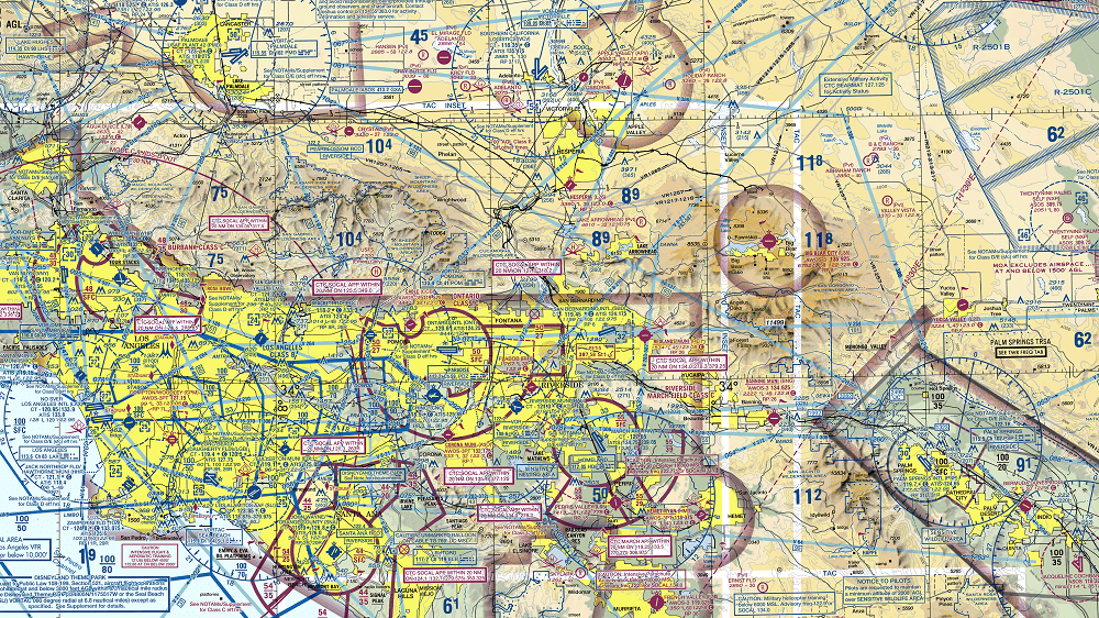
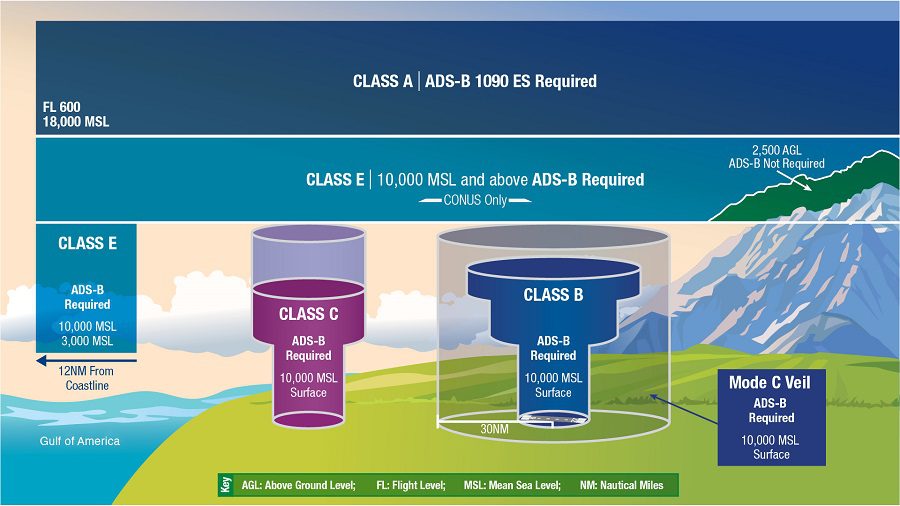
Airspace Classification: Navigating the Invisible Boundaries
Airspace boundaries are invisible from the cockpit, yet essential for safe and legal flight. Understanding how to read sectional charts is crucial for pilots navigating both controlled and uncontrolled airspace. These charts use specific symbols and colors to represent airspace classes, terrain, obstacles, and navigational aids. The delineation of airspace classes is one of the most important features on sectional charts. This section will decode how each airspace class, from A through G, is visually represented and what that signifies for pilots.
Visualizing Airspace Classes
This infographic illustrates how chart symbols represent key features like airports, navigation aids, and the various airspace classifications. It provides a visual key to understanding the chart’s language. The connections between symbol categories, their icons, and functions highlight how seemingly small details translate to real-world implications for pilots. This understanding is fundamental to safe and efficient navigation.
Class B Airspace: The Solid Blue Line
Class B airspace, represented by solid blue lines, surrounds the busiest airports. It’s structured like an inverted wedding cake with layers extending upward and outward, forming a protective bubble. Entering this airspace requires explicit clearance from Air Traffic Control (ATC). Approaching a Class B airport often involves specific altitude and heading instructions from controllers. This underscores the importance of correctly interpreting the chart’s depiction of this airspace.
Class C and D Airspace: Magenta and Dashed Blue Lines
Class C airspace, depicted by solid magenta lines, indicates a medium-sized airport with a control tower. Two-way communication with ATC is required, but unlike Class B, explicit clearance is not. Class D airspace, shown as dashed blue lines, represents smaller towered airports. It usually extends from the surface to 2,500 feet above ground level (AGL). Recognizing these distinct visual representations allows pilots to quickly assess communication requirements and altitude restrictions.
Class E and G Airspace: The Unseen Boundaries
Class E airspace can be a bit trickier to identify on sectional charts. It’s represented by dashed magenta lines when starting at the surface, faded magenta lines starting at 700 feet AGL, and faded blue lines starting at 1,200 feet AGL. Class G represents uncontrolled airspace. It is not delineated by lines on the chart. Understanding these nuances is crucial, especially for pilots transitioning between controlled and uncontrolled airspace. Airspace knowledge is essential for safe VFR flight. You can learn more about different types of airspace here.
Practical Applications and Memory Techniques
Experienced pilots develop mental models to quickly assess airspace characteristics. They visualize the three-dimensional structure of the airspace based on the two-dimensional representation on the chart. Memory techniques, such as associating colors with airspace classes (blue for B, magenta for C), can also be beneficial. Perhaps you’d be interested in learning more about flight computers? By combining chart interpretation with practical knowledge and effective memory aids, pilots confidently navigate the invisible boundaries of the sky.
Terrain and Obstacle Recognition: Your Visual Safety Net
Understanding airspace is crucial for safe flight, but equally important is understanding the ground below. This section explores how sectional charts represent terrain and obstacles, equipping you with the tools to maintain safe clearances and avoid potential hazards. We’ll delve into the visual language of contour lines, shaded relief, and color gradients, essential for translating the chart’s 2D representation into a 3D understanding of the terrain.
Deciphering the Contour Lines
Contour lines on sectional charts connect points of equal elevation, much like the rings on a topographic map. Closely spaced lines indicate steep terrain, while widely spaced lines signify gentler slopes. This allows you to quickly visualize the shape of the land below. For instance, a series of tightly packed contour lines forming a circle suggests a sharp peak or a steep valley.
Shaded Relief and Color Gradients: Adding Depth to Your View
Shaded relief and color gradients complement contour lines by providing a more intuitive sense of terrain elevation. Darker shading typically indicates higher elevations, transitioning from greens in valleys to browns and even white at the highest peaks. This allows you to quickly grasp the overall terrain profile without meticulously analyzing individual contour lines. Furthermore, recognizing these visual cues enables faster identification of potential hazards, such as rapidly rising terrain or deep canyons.
Maximum Elevation Figures (MEFs): Crucial Safety Information
Within each quadrangle on a sectional chart, you’ll find a Maximum Elevation Figure (MEF). This vital number represents the highest obstacle within that quadrangle, encompassing both terrain and man-made structures, plus a safety buffer. This means flying above the MEF ensures adequate clearance from all known obstacles in that area. Pilots frequently use MEFs as a quick reference for establishing minimum safe altitudes, particularly in unfamiliar terrain.
Identifying Man-Made Obstacles
Sectional charts also depict man-made obstacles, such as towers and power lines. These are represented by specific symbols accompanied by their heights in feet Mean Sea Level (MSL) and Above Ground Level (AGL). Calculating the true height of an obstacle requires adding the AGL value to the terrain elevation at its base. This data is crucial for planning safe routes and maintaining sufficient clearance, especially during takeoff and landing. Learn more in our article about the minimum required instruments for VFR flight.
Real-World Examples and Terrain Avoidance
Imagine a flight through mountainous terrain. By understanding contour lines, shading, and MEFs, you can anticipate areas of rising terrain and plan your route accordingly. You might choose to follow a valley floor, staying above the MEF, or select a higher altitude offering ample clearance over all peaks. This ability to visualize the terrain and plan proactively is essential for safe and effective terrain avoidance. You might be interested in: How to Master Mountain Flying, a great resource covering terrain and obstacles encountered in flight.
This understanding of terrain and obstacles, coupled with sound judgment and decision-making, provides the skills and discipline needed to navigate safely, allowing for informed choices based on a comprehensive understanding of the landscape below.
Airports and Navaids: Building Your Navigation Blueprint
Effective navigation involves more than just getting from point A to point B. It’s about building a solid understanding of your position within the airspace. This section will explore how to understand the symbols used for airports and navigational aids (navaids) on sectional charts, turning these symbols into practical tools for enhanced situational awareness.
Decoding Airport Symbols: More Than Just a Dot on the Map
Airport symbols on sectional charts are packed with information. The symbol’s shape and color immediately tell you if the airport is towered or non-towered. A blue circle signifies a towered airport, while a magenta circle indicates a non-towered field.
Further details accompanying the symbol reveal runway lengths, surface types, and the services available at the airport. This information helps pilots anticipate the operational environment and accordingly plan their approach.
The following table provides a detailed guide to interpreting airport symbols:
Airport Symbols and Information Guide
| Symbol | Meaning | Examples | Additional Information |
|---|---|---|---|
| Blue Circle | Towered Airport | Class D, Class C, Class B | Often includes associated tower frequency |
| Magenta Circle | Non-Towered Airport | Private, Public | Often includes CTAF frequency |
| Tick Marks extending from circle | Runway Information | Number and orientation of tick marks represent runway headings | Length of tick marks can indicate relative runway length |
This table summarizes key features of airport symbols and how they translate to real-world airport characteristics. Understanding these symbols is essential for making informed decisions during flight planning and execution.
Additionally, airport symbols will often show abbreviated communication frequencies, such as CTAF (Common Traffic Advisory Frequency) for uncontrolled airports and tower frequencies for controlled airports. Knowing these abbreviations is critical for establishing and maintaining clear communication. This readily available frequency information simplifies communication, especially in demanding situations.
VORs as Navigational Anchors: Finding Your Way in the Sky
VORs (Very High Frequency Omnidirectional Range) are radio navigation aids that emit signals in all directions (360 degrees). This allows pilots to determine their bearing relative to the VOR station. The symbol for a VOR on a sectional chart looks like a small compass rose and includes the VOR’s frequency and identifier.
Pilots use this information to tune their navigation radios to the correct frequency and track radials to or from the station. The range of a VOR’s usable signal is also shown on the chart, providing critical information for flight planning.
Knowing the service volume of a VOR lets pilots choose the best stations for their planned route and ensures they receive a dependable signal. This is particularly important in areas where GPS coverage may be limited or unreliable.
NDBs and Visual Landmarks: Adding Layers to Your Navigational Toolkit
NDBs (Non-Directional Beacons), while less precise than VORs, offer another valuable navigational reference. They appear as small dots on the chart with their associated frequency. You can learn more about navigational aids in this article: Navigational Aids: An Introduction for Student Pilots.
Visual landmarks, such as prominent terrain features, bodies of water, and highways, supplement electronic navaids and contribute to a pilot’s overall situational awareness.
Addressing Common Challenges and Confusion
Interpreting all of the information on a sectional chart can be difficult, especially for those new to flying. It’s essential to become familiar with the various symbols and abbreviations. One common point of confusion is differentiating between types of airports.
By regularly reviewing the chart legend and practicing your symbol identification, you can develop your chart reading skills and become a more confident pilot. This investment in basic knowledge directly translates to safer and more enjoyable flying experiences.
Special Use Airspace: Navigating the No-Fly Zones
The freedom of flight carries with it the responsibility to understand and respect airspace restrictions. This section explores how to interpret Special Use Airspace (SUA) on sectional charts, allowing you to navigate these areas safely and legally. Understanding SUA is essential for both pre-flight planning and in-flight decision-making.
Decoding the Visual Language of SUA
Sectional charts use distinct colors and borders to represent Special Use Airspace. Prohibited Areas, the most restrictive type, are marked with bold red borders. These areas are strictly off-limits, with very few exceptions. Less restrictive, but still requiring careful attention, are Restricted Areas. These are depicted with blue borders and solid blue vertical hash marks inside. Restricted Areas often have specific activation times and purposes, such as military training exercises.
Military Operations Areas (MOAs), marked with a solid magenta border, often cover large portions of airspace. MOAs are frequently active. While not strictly prohibited, pilots should exercise caution and contact the controlling agency before entering a MOA.
For more information on flying near or through MOAs, check out our guide on Can You Fly Through a Military Operations Area (MOA)?.
Alert Areas, indicated by a thin magenta border with magenta hash marks inside, highlight areas of high pilot training activity or unusual aerial operations. While not restricted, they encourage pilots to increase their vigilance. These visual cues provide pilots with a quick way to assess the restrictions imposed by different SUAs.
Interpreting the Accompanying Text
Visual identification alone is insufficient for understanding SUA. Each SUA on a sectional chart includes a text box with essential details. This text provides the area’s name, activation times, altitudes affected, and the controlling agency’s contact information. For example, a restricted area may only be active during specific weekday hours. The controlling agency’s contact information is vital for obtaining permission to enter or for updates on the area’s status.
Real-Time Data and Flight Planning
Sectional charts offer a static view of airspace. SUA status can change, so pilots need current information. A Military Training Route (MTR), for instance, could be temporarily active within a MOA outside of its published times. This makes consulting real-time sources essential. Pilots should check Notices to Airmen (NOTAMs) and obtain a flight service briefing before and during flight.
Professional flight planners integrate SUA data into route planning. They often route flights around restricted airspace to minimize complexity and potential conflicts. When crossing a restricted area is unavoidable or more efficient, they coordinate with the controlling agency to obtain the necessary clearances in advance.
Approaching Restricted Airspace: What to Do
Inadvertently approaching restricted airspace can happen. The key is to remain calm. Immediately contact the controlling agency, provide your identification and location, and then follow their instructions. They might instruct you to change your course, altitude, or both. This quick action enhances safety and mitigates potential issues.
Learning to interpret special use airspace is crucial for responsible flight. Combining the information on sectional charts with real-time data equips you to navigate these areas confidently and legally. It allows you to fly safely, within legal boundaries, and with peace of mind.
Beyond the Chart: Building Your Complete Navigation Picture
Sectional charts are a fundamental tool for VFR navigation, providing a bird’s-eye view of the terrain and airspace. However, they only tell part of the story. For a truly complete understanding of the navigational landscape, pilots need to integrate several other crucial resources.
The Chart Supplement: Your Airport Encyclopedia
The Chart Supplement (formerly A/FD) acts as a detailed directory for airports. While sectional charts offer basic airport information, the Chart Supplement dives deeper, providing specifics on runway lengths and surfaces, lighting systems, available services (like fuel and maintenance), and communication frequencies.
This detailed information empowers pilots to make well-informed decisions about their landings and approaches. Imagine thinking an airport is suitable based on the sectional chart, only to find out from the Chart Supplement that the runway is closed for maintenance! The Chart Supplement helps avoid these potentially frustrating and dangerous scenarios.
NOTAMs: Staying Up-to-Date on Critical Changes
Notices to Airmen (NOTAMs) are essential for staying informed about time-sensitive changes that can impact flight safety. These notices alert pilots to potential hazards like temporary flight restrictions (TFRs), changes to airspace, airport conditions, and other crucial details not yet included on printed charts or even in some electronic flight bag databases.
A NOTAM could warn you about a recently constructed crane near your flight path, information absent from the sectional chart itself. This real-time information is invaluable for avoiding unexpected obstacles.
Weather Resources: Planning For the Unexpected
Weather is a dynamic element in aviation, impacting every flight. Integrating current weather information with your chart analysis is paramount. Resources like aviation weather reports, forecasts, and radar imagery enable pilots to anticipate and avoid hazardous conditions.
Pilots can make informed decisions about flight plans, whether to delay, reroute, or even cancel a flight, based on current and predicted weather patterns. Access to these resources allows for strategic decision-making and contributes to safer flying.
Electronic Flight Bags (EFBs): Modern Tools for Navigation
Electronic Flight Bags (EFBs) provide digital versions of sectional charts, the Chart Supplement, and access to real-time weather data. They offer significant advantages, including reduced paper clutter and readily available updates. However, EFBs also come with considerations.
Battery life, screen glare, and the potential for software issues are all factors pilots must manage. Relying solely on digital tools can be risky. Prudent pilots understand these limitations and always carry backup paper charts.
Building Your Workflow: Organizing For Success
Developing a systematic approach to pre-flight planning is essential for safe and efficient flying. This could involve a checklist that includes checking NOTAMs, reviewing the Chart Supplement, and obtaining a weather briefing.
In-flight, cross-referencing chart information with observed landmarks reinforces situational awareness. During high-workload periods, an organized cockpit and a well-practiced workflow are crucial, allowing for quick access to vital information.
Final Thoughts
Sectional charts are a foundational element of VFR navigation, but their effectiveness is amplified when integrated with these supplementary tools. Combining chart data with real-time information and a structured approach creates a comprehensive navigational picture. This enhances safety, reduces pilot workload, and builds confidence in the air.
Recent Posts
FAA MOSAIC Final Rule: What Pilots, Manufacturers, and the Aviation Community Need to Know
Learn how the FAA’s MOSAIC final rule revolutionizes Light-Sport Aircraft certification, expands Sport Pilot privileges, and reshapes general aviation. See what’s changing, when it takes effect,...
Student Pilot Insurance: Essential Coverage for Aspiring Flyers
Discover how student pilot insurance can protect your flying dreams. Get expert tips and coverage options to ensure your safety and peace of mind.